 Flooring Correct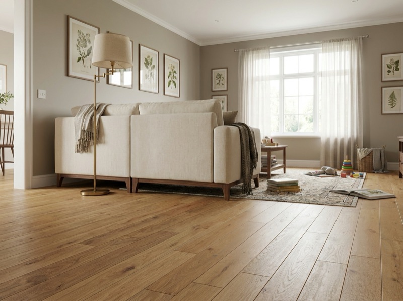
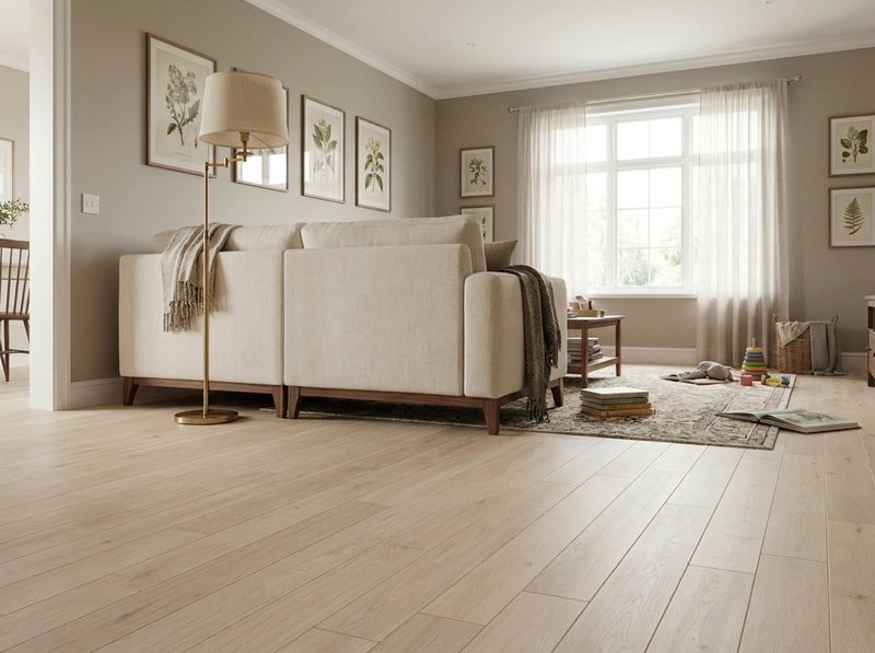
What flooring goes with white kitchens?
Start with the white itself, not the floor. White cabinets carry a warm cream undertone or a cool blue-gray one, and that fact narrows the field before anything else is discussed. From there the kitchen's water and traffic demands set the material, and only then does contrast level get decided. Skipping the undertone step is the most common reason a floor stops looking right once it is down.
Step one: read the white before anything else
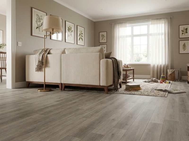
White is not one color, and treating it like one is where a lot of kitchen floor decisions go wrong. A cream-leaning white carries a warm undertone, and it sits comfortably against warm wood tones and warm-toned stone or vinyl. A crisp, blue-leaning white runs cool, and it agrees with grayer, cooler flooring the way a warm white fights it. The undertone is usually visible on the cabinet paint chip itself, and it is worth pulling that chip before comparing a single floor sample against it.
This is the step that actually decides the outcome. Get it wrong and every later decision, material, contrast, grout, has to fight the mismatch instead of building on it.
Step two: let the kitchen narrow the material
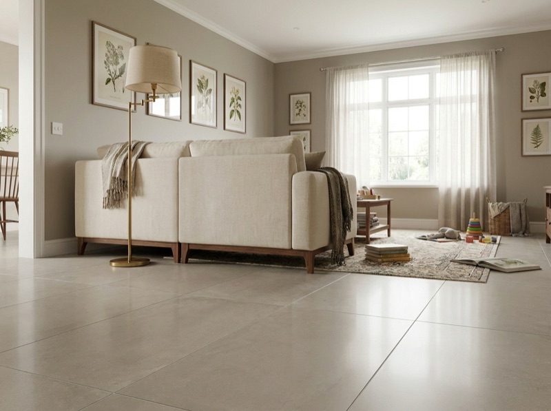
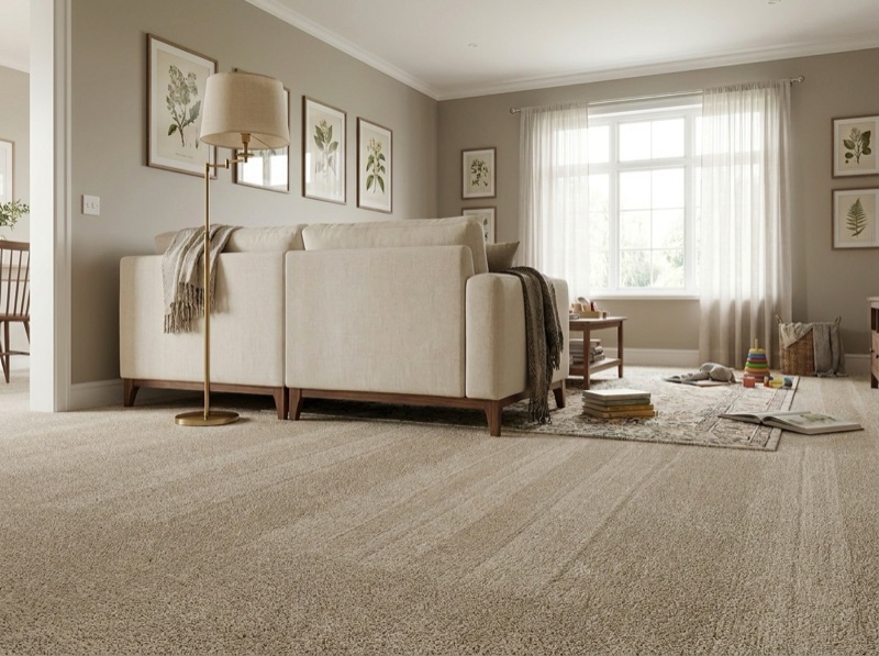
Once undertone points you toward a warm or cool family, the room itself does the next round of narrowing. A kitchen floor deals with standing water at the sink, dropped pans and long stretches of standing, and that reasoning is covered in full here rather than repeated on every page that touches a kitchen. In practice that puts luxury vinyl plank, tile and sheet vinyl ahead of solid hardwood and carpet in a white kitchen the same as any other, regardless of undertone.
White cabinets do add one wrinkle worth naming. Because the field of white above the floor is large and unbroken, whatever undertone the floor carries reads more clearly against it than it would against a busier, colored cabinet run. A warm vinyl or tile against a cool white shows itself faster in this setup than the same pairing would in a kitchen with more visual noise, which is one more reason to settle undertone before narrowing the material rather than after.
Step three: decide how much contrast you actually want
With undertone and material both narrowed, contrast is the real style decision left. A floor close in value to a white cabinet reads calm and lets other elements, hardware, a backsplash, a counter surface, carry the visual interest. A floor several shades darker than the cabinet defines the room's boundary clearly and tends to photograph as more deliberate. Neither is more correct. It is a choice worth making on purpose rather than by accident, and it is a separate question from whether the floor should be lighter or darker than a cabinet generally, which has its own answer.
Step four: check it against the grout, the hardware and the counter surface
The last step is confirming the floor against everything else already chosen or already in the room. If the material is tile, grout color either blends into the field for a calm read or contrasts on purpose, and either choice interacts with a white cabinet differently than it would with a stained wood one. Cabinet hardware finish and the counter surface both carry their own undertone too, and a floor that agrees with the cabinet but fights the hardware or the counter still reads as slightly off, which is why bringing all three to the showroom together beats bringing the cabinet door alone.
Where the sequence actually gets settled
Walking these steps in order, undertone, then material, then contrast, then the surrounding finishes, is faster and more reliable than starting from a floor sample and working backward. It also saves a return trip, since a floor chosen from the field material alone often turns out to fight the hardware or the counter once all three are finally seen together, and that is a slower way to arrive at the same shortlist.
Bring the cabinet paint chip, a piece of the counter surface if you have an offcut, and a photo of the hardware, and we will build the shortlist in that order at 15570 Veterans Memorial Pkwy. The free in-home measure is where appliance heights and cabinet edges get sorted out once the material itself is chosen.
More on white kitchens and the floor underneath them
Dark floors, cream versus true white, and where the grout fits into the same decision.
636-332-0654No, and treating it as a rule skips the undertone step that actually decides it. A dark floor with a warm undertone against a cool white cabinet can fight the room the same way a mismatched light floor can. Value contrast is a real, separate decision, but it only reads well once the undertone between the white and the floor already agrees.
Cream leans warm, and it is worth treating that as a genuine undertone rather than rounding it to plain white. A cream cabinet generally agrees with warmer wood tones and warm-toned vinyl or tile the way a crisp, blue-white cabinet agrees with cooler, grayer flooring. Pull the actual paint chip rather than guessing from memory, since cream and pure white read very differently once a floor sample sits next to them.
It depends on the read you want. Matching grout to the tile keeps the floor reading as one calm surface, which suits a white kitchen that already has visual interest in the cabinets or the backsplash. A contrasting grout draws the pattern and every cut line on purpose, which can work well in a kitchen that is otherwise kept simple. Bring both grout options next to the actual white sample before deciding.
Narrow the material before the color
Bring the cabinet paint chip and a piece of the counter surface if you have an offcut. We'll walk the same four steps with you and set full-size pieces against them.
Free estimate
636-332-0654