 Flooring Correct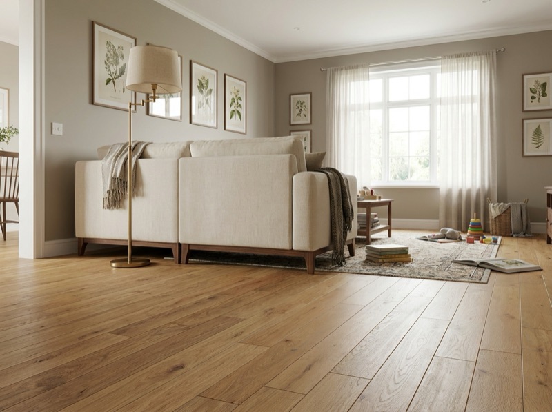
What flooring suits a modern home?
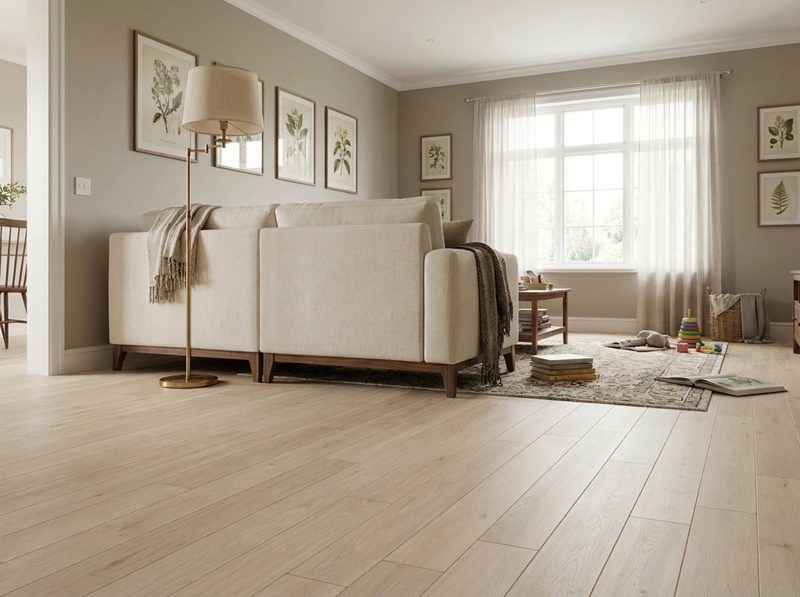
Modern reads through the floor's surface behavior more than its material: large format pieces, minimal grain or pattern, a low matte sheen, and a tight neutral palette with few seams breaking up the field. Busy grain, high gloss, or strong color contrast fights that look regardless of species. Bring a room photo and match samples against real light.
Modern is a behavior of the surface, not a species
People walk into the showroom asking for a modern floor as if it were a color on the wall. It is closer to a set of physical rules the surface has to follow. A modern room reads as one continuous plane, and a floor helps or hurts that plane through four things: how big each piece is, how much grain or pattern shows on it, how the light bounces off the finish, and how tight the color range runs from board to board or tile to tile.
Sheen is the one people underestimate. A high gloss finish throws light unevenly across a room, and every reflection reads as a separate bright spot competing for attention. A low, matte sheen diffuses that same light evenly across the whole floor, so the eye reads one calm surface instead of a dozen hot spots. That is the actual mechanism behind why a matte finish feels current and a glossy one does not, independent of what the floor is made of.
What that means once you are standing at the sample rack
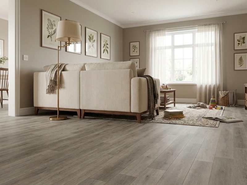
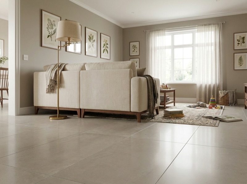
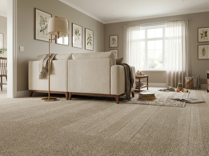
Translate those rules into what we actually carry and the picture gets specific fast. In hardwood and engineered hardwood, that points toward a quieter species and a plainer sawn face rather than a wildly figured one, in a wider board that needs fewer seams to cover the same floor. In tile, it points toward large format porcelain with grout matched close to the tile color, so the joints stop announcing themselves as a grid. In luxury vinyl plank, it means a wide plank in a low sheen embossed texture instead of a high gloss print. Carpet can hold up its end too, in a level, low pile construction with a tight tonal weave rather than a busy multicolor pattern.
None of this locks you into one material. It is a filter you can run any material through. A photo of the room and a walk through our gallery of finished jobs will show you the same rule playing out in hardwood, tile and vinyl side by side.
Where the look quietly falls apart
The failure mode is almost never an ugly floor. It is a good floor that fights the room it is in. A species with heavy color variation and busy grain, or a plank with a deep hand scraped texture, reads as warm and traditional even in a color that photographs as neutral, because the eye is responding to the amount of visual activity in the surface, not the hue. The same is true of a strong contrasting grout line on a small tile, or a shiny high gloss sheen catching the recessed lighting a modern kitchen usually has. Any one of those can undo an otherwise correct color choice, which is why the surface traits matter more here than the swatch.
Open sightlines make this worse rather than better. A modern floor plan usually runs one material through several rooms with few walls to break it up, so a busy or reflective surface has more room to repeat itself and draw the eye than it would in a single closed room.
How to check a sample before you order
Judge full size pieces, not the small chip on the wall. Lay two or three boards or tiles edge to edge on the floor of the actual room, step back to where a person would actually stand, and see whether the joints disappear or announce themselves. Then look at it again with the room lights on at night, because a sheen that looks calm under showroom fixtures can throw a completely different reflection under your own can lights. Bring a photo of the room and, if you have one, the cabinet or trim sample it has to sit next to.
That is exactly what a visit to the Wentzville showroom is for. Full size boards and tiles are out on the racks, not folders of chips, and the free in-home measure is where the room's actual sightlines, doorways and lighting get accounted for before anything is ordered. Call 636-332-0654.
What else people ask about a modern floor
Color range, wood species, pattern, and what to do when the trim already leans warm.
636-332-0654No. The color range matters less than the traits underneath it. A warm quiet oak in a low sheen with tight color consistency can read just as current as a cool gray plank, because both follow the same rules of minimal grain activity and a calm, even finish. The color is a preference layered on top of the mechanism, not the mechanism itself.
Yes, and it is one of the more popular routes people take. A straight sawn or rift and quartered face with plain, consistent grain, in a wider board and a matte or low sheen finish, reads current in a way a heavily figured, high gloss board does not. Species and construction are covered on our hardwood and engineered hardwood pages, so bring the look you want and we will point you at the right one.
It can, depending on the material and the scale of the piece. A fine, tight herringbone in a plain quiet wood or a large format tile can sit comfortably in a modern room, while a small, high contrast pattern reads busier and pulls the room toward a more traditional feel. It comes down to the same grain and contrast rules as any other floor, applied to a laid pattern instead of a plank.
Then the floor gets chosen to sit quietly next to what is already there rather than fight it. A quiet, plainer grain in a warm tone can still read current if the sheen stays low and the color range stays tight. Bring the cabinet door or a trim sample to the showroom and we will set boards and tile next to it before anything is decided.
Price a floor for an open, modern plan
Tell us which rooms run together and what the sightlines look like. We measure the actual space and account for the light before we quote it.
Free estimate
636-332-0654