 Flooring Correct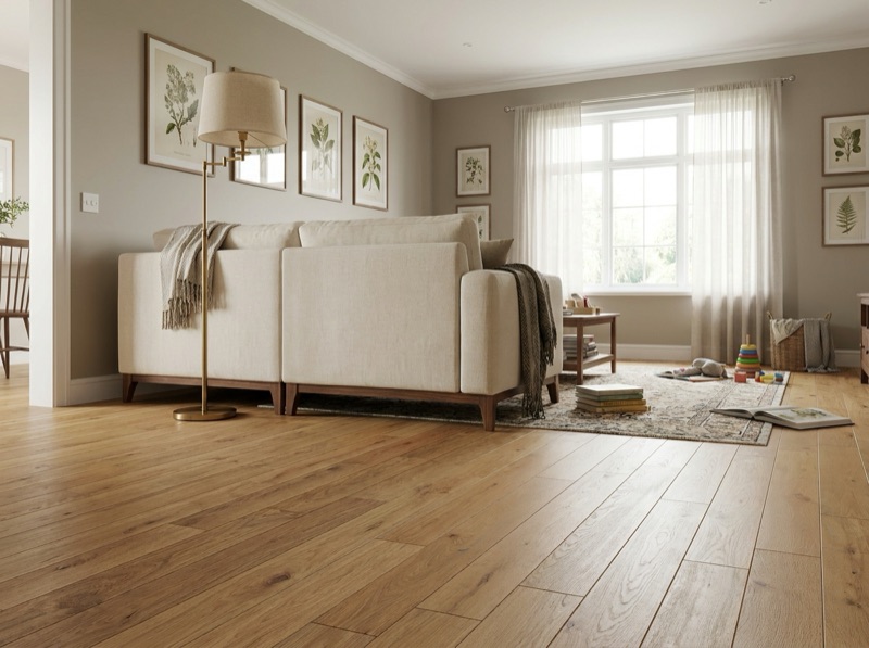
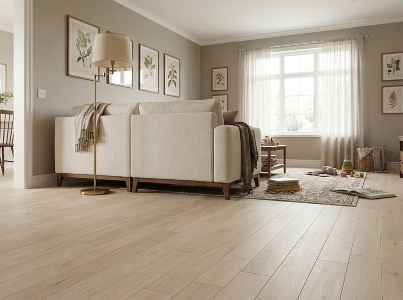
What is the most timeless flooring choice?
There is no single timeless material; there is a timeless sequence of decisions inside any material. Pick a construction on its own merits first, keep the grain and pattern activity moderate, then choose a mid depth, neutral undertone rather than a strongly warm or cool one. Undertone is the step that ties a floor to a decade faster than anything else.
Step one: choose the construction before you think about style at all
The question gets asked as if one material holds up better than the rest. It does not work that way. Solid hardwood, engineered hardwood, tile, luxury vinyl plank, laminate and carpet all have decades old examples that still look right and decades old examples that look exactly like the year they went in. The material is not the variable. So the first step is to set style aside completely and choose the construction on what the room actually needs: whether it sits on a slab, whether it gets wet, how much traffic crosses it. That decision gets settled elsewhere on the site and does not belong here. What belongs here is everything you decide once the construction is already right for the room.
Step two: keep the grain and pattern activity in the middle
Once the construction is settled, look at how much visual activity is happening on the surface. This is a spectrum, not a binary, and both ends of it age faster than the middle. A very plain, uniform surface with almost no grain variation can look like a specific era of production flooring once you have seen enough of it. A very busy, dramatically figured surface reads as a strong personal statement, which is exactly why it feels dated once the moment that produced it has passed. The floors that keep reading as current are usually the ones with real, moderate grain movement: enough texture to look like a natural material, not so much that the eye reads it as a pattern.
Step three, and the one that actually decides it: undertone
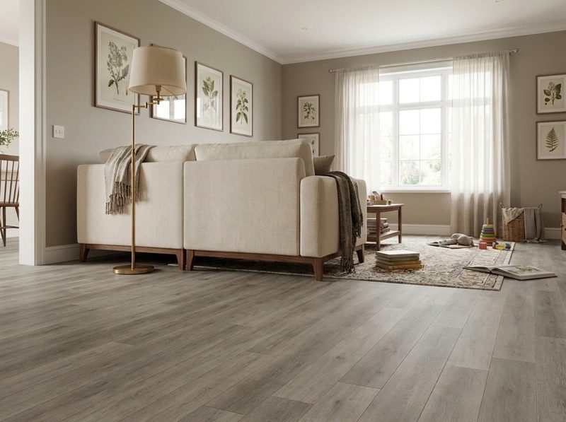
This is the step people skip, and it is the one that matters most. Undertone is the underlying warmth or coolness in a color, the pink or orange running under a warm wood tone, or the gray or green running under a cool one. Design trends move in undertone waves more than in any other single trait, because undertone is what a whole room's palette gets built around, from the walls to the cabinets to the trim. A floor with a strong, specific undertone gets tied to whatever else was being chosen alongside that undertone at the time, and it dates with the rest of the room even if the floor itself never wears out. A mid depth color with a neutral, restrained undertone sits comfortably next to warm and cool palettes alike, which is the actual mechanism behind why it keeps looking right years after a stronger, trendier undertone starts to feel specific to a moment. Depth matters here too. Very pale and very dark floors both photograph well and both commit a room harder than a mid depth tone does, for the same reason a strong undertone commits it: everything else in the room has to keep agreeing with an extreme choice.
Step four: sheen and format, the smaller adjustments
With construction, grain and undertone settled, sheen and plank or tile format are the fine tuning. A lower sheen ages more gracefully than a high gloss finish, because gloss shows scuffs and reflects light in a way that photographs as a specific look rather than a neutral surface. Format follows the same logic: a plank or tile width that feels proportional to the room, rather than unusually wide or narrow for its own sake, keeps the floor from reading as a specific design moment when the fashion for extreme proportions shifts. Neither choice moves the needle as much as undertone does, but both are easy to get right once undertone is settled.
Running the sequence against real samples
This sequence only works with actual material in hand, because undertone especially is nearly impossible to judge from a photograph or a screen. Bring a cabinet door, a trim sample or a paint chip and set candidate floors next to it under your own light, not the showroom's. Walk the racks at the Wentzville showroom with the sequence in this order: right construction for the room, moderate grain, neutral mid depth undertone, then sheen and format. The samples that survive all four are the ones worth taking home. Call 636-332-0654.
What else people ask about choosing a lasting floor
Species, grain intensity, extreme depths, and whether the same logic holds outside of wood.
636-332-0654White oak's popularity right now comes from its naturally neutral, slightly cool undertone and its straight, quiet grain, which happen to line up with the sequence above better than a species with heavier color variation. That is a reason it is a safe pick, not proof that it is inherently more timeless than every other species on the rack.
Not always, but it carries more risk. A dramatic, high contrast grain reads as a specific style choice, which is exactly what makes it feel tied to a moment once that style has moved on. A moderate, natural amount of grain movement is the safer middle ground if longevity matters more to you than making a bold statement.
Not necessarily, but understand what you are choosing. Both extremes photograph beautifully and both commit the rest of the room to agreeing with them. If longevity of the look matters more than the dramatic effect, a mid depth tone gives everything else in the room more room to change around it over time.
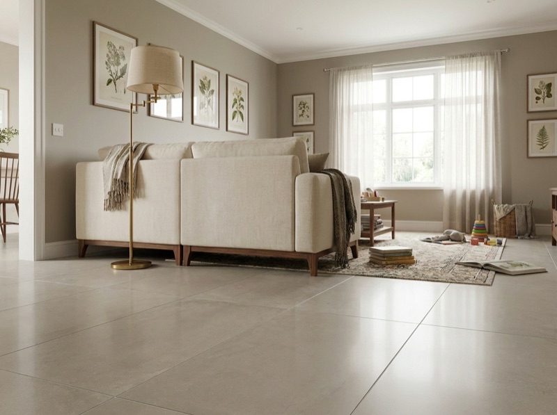
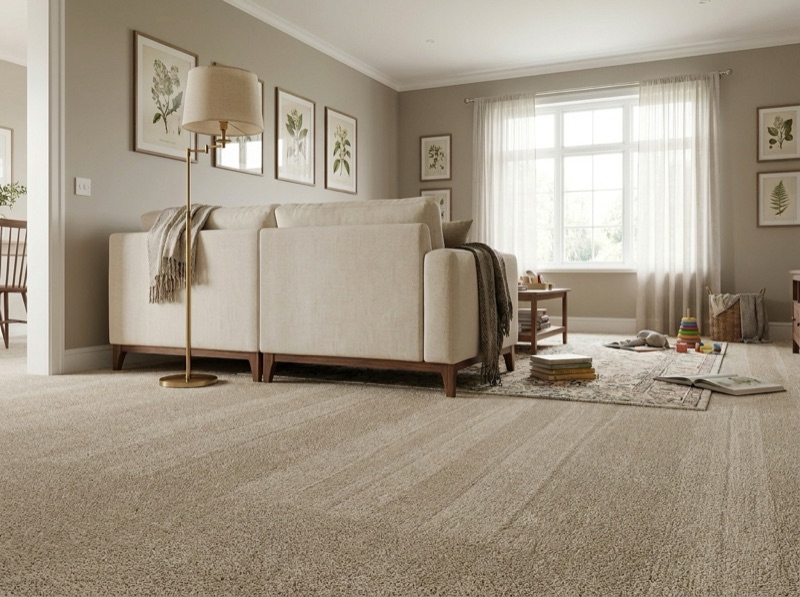
Yes. Undertone, grain or pattern activity, depth and sheen apply the same way across every material we sell. A tile grout color carries an undertone just as a wood stain does, and a carpet fiber's dye carries one as well, so the same sequence is worth running whichever material you end up choosing.
Narrow it down to a material
Tell us the room and what has to sit next to it. We will run construction, grain and undertone against real samples before you order.
Free estimate
636-332-0654