 Flooring Correct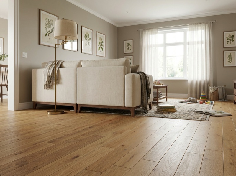
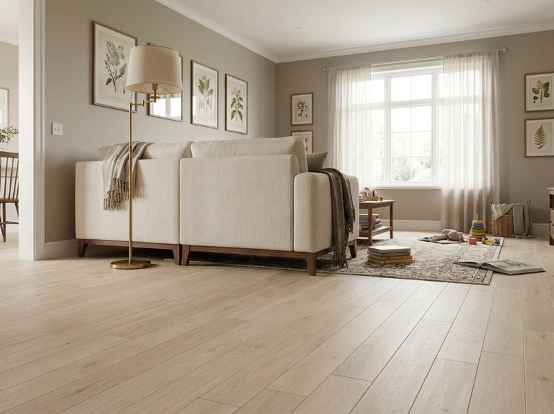
What flooring color makes rooms look bigger?
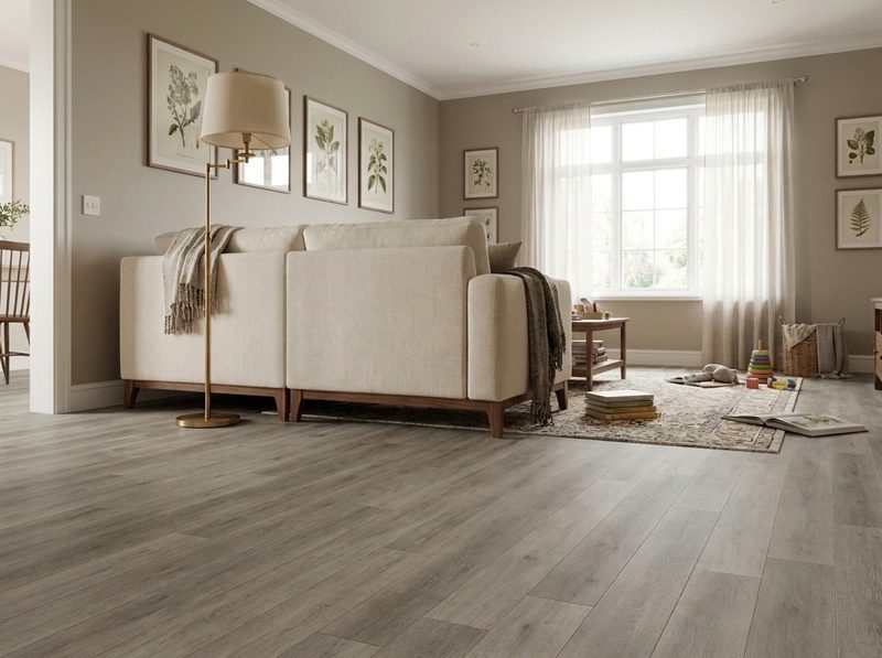
There is no single shade that does it. The real decision is between two strategies: a pale floor kept close in tone to the walls and trim, so the eye never stops at a boundary, or a mid-tone floor carried through an open doorway, so the sightline reads as one continuous space. A closed room usually wants the first. A room open to another one wants the second.
The decision you are actually making
Most people ask this question looking for a single color name, and there is not one. What actually makes a room read larger is where the eye stops, and a floor controls that in two different ways depending on how the room connects to the rest of the house. Picking the right one for your room, not the prettiest chip on the wall, is the whole decision.
Option one: erase the boundary at the baseboard
In a closed room, one with a door and four walls that end where the room ends, a floor kept close in tone to the trim and lower walls removes the visual line where floor meets wall. The eye reads the space as continuous rather than boxed, because there is nothing telling it where the room stops. This works with pale colors most reliably, since light bounces further before it reads as shadow, but the mechanism is closeness in value between floor and trim, not paleness by itself.
The honest limit here is durability and dirt. A very pale, low-contrast floor in a room with real traffic will show marks faster than a mid-tone one, which is the same contrast mechanism covered in full on our dirt-hiding page. This option earns its keep in a room with light traffic, a formal dining room or a guest bedroom, more than a kitchen or a mudroom.
Option two: carry one floor through the doorway
In a room that opens to another, a kitchen into a dining space, a living room into an entry, the bigger lever is not the shade at all. It is whether the same material and color run through the doorway without a transition strip breaking the sightline. A room that borrows visual square footage from the room next to it reads larger than the same room sealed off with a change of material at the threshold. Mid-tone colors work well here because they read consistently under two different rooms' lighting, where a very pale shade can shift and look mismatched from one side of the doorway to the other.
This is also where plank direction earns its place in the decision, and it already has a full answer of its own on the living room page, which covers how boards running toward a window stretch a sightline. Treat that as the second lever once continuity is settled, not the first.
The conditions that pick between them
A closed room with its own door and no sightline into another space gets the low-contrast, floor-to-trim strategy. A room that is genuinely part of an open plan, where a doorway or a peninsula is the only thing separating it from the next room, gets the continuous-run strategy instead, and the color decision follows from what the connected room already needs, not from this room alone. A room that is small but poorly lit is the harder case, because pale floors need real daylight to do their job, and without it a mid-tone can outperform a pale one that just looks dim instead of large.
Cabinet color and wall color both narrow the field further, and each has an answer of its own: what pairs with oak cabinets, and what pairs with a white kitchen specifically, are separate questions from this one.
What to bring and where to check it
Bring a photo of the room taken from the doorway you actually stand in most, not a straight-on shot of one wall, because that is the sightline the color has to work in. If the room opens to another, bring a sample or photo of that room's flooring too, so continuity can be checked against something real rather than a memory of the color. We will set full-size pieces against both in the room's own light at 15570 Veterans Memorial Pkwy, and the free in-home measure is where the doorway transitions themselves get planned.
More on color, format and reading a room larger
Wall matching, small rooms with weak light, and where tile and plank format fit into the decision.
636-332-0654Not exactly, and an exact match can look flat or accidental rather than deliberate. What matters is closeness in value, meaning how light or dark each surface reads, more than matching the hue precisely. A floor a shade or two off the wall in the same warm or cool family still erases the boundary effectively, and it hides the inevitable wear a floor takes on that a wall never does.
No. A small, enclosed room with good daylight benefits most from a pale, low-contrast floor. A small room with limited natural light, or one that opens into a larger connected space, often reads larger with a mid-tone floor carried through the doorway than with a pale floor that simply looks dim under weak light. Room shape and light matter more than square footage alone.
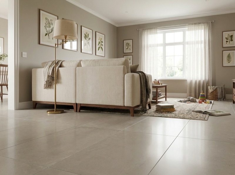
Format helps alongside color, and it works through a related but different mechanism: fewer seams and grout lines mean fewer breaks in the surface for the eye to count. It reinforces a continuous-run strategy well, since a large format with a matching, low-contrast grout reads as close to one uninterrupted plane as a floor gets.
Bring the doorway photo, not the paint chip
A shot from where you actually stand tells us more than a swatch. Bring it, along with a sample from any room this one connects to, and we'll set full-size pieces against both.
Free estimate
636-332-0654